This notebook is a summary of python plots. The purpose is to able to quickly get examples for plots in the future usage.从零开始学Python【1】—matplotlib(条形图) 从零开始学Python【2】—matplotlib(饼图) 从零开始学Python【3】—matplotlib(箱线图) 从零开始学Python【4】—matplotlib(直方图) 从零开始学Python【5】—matplotlib(折线图) 从零开始学Python【15】—matplotlib(散点图) 从零开始学Python【7】—matplotlib(雷达图)
jupyter widget example is coming from:Interactive Python with Widgets
The data set in this blog can be found in github page:https://github.com/supersheepbear/notebooks/tree/master/python
1
2
3
4
5
import matplotlib.pyplot as pltimport matplotlib.mlab as mlabimport numpy as npimport pandas as pdimport scipy.stats as scs
plot styles
['bmh',
 'classic',
 'dark_background',
 'fast',
 'fivethirtyeight',
 'ggplot',
 'grayscale',
 'seaborn-bright',
 'seaborn-colorblind',
 'seaborn-dark-palette',
 'seaborn-dark',
 'seaborn-darkgrid',
 'seaborn-deep',
 'seaborn-muted',
 'seaborn-notebook',
 'seaborn-paper',
 'seaborn-pastel',
 'seaborn-poster',
 'seaborn-talk',
 'seaborn-ticks',
 'seaborn-white',
 'seaborn-whitegrid',
 'seaborn',
 'Solarize_Light2',
 'tableau-colorblind10',
 '_classic_test']
bar plot vertical 1 2 3 4 5 6 7 8 9 10 11 12 13 14 15 16 17 18 19 20 21 22 23 24 25 26 27 28 29 30 31 x = range(4 ) GDP = [12406.8 ,13908.57 ,9386.87 ,9143.64 ] plt.rcParams['font.sans-serif' ] =['Microsoft YaHei' ] plt.rcParams['axes.unicode_minus' ] = False plt.bar(x, GDP, align = 'center' ,color='steelblue' , alpha = 0.8 , width=0.6 ) plt.ylabel('GDP' ) plt.title('四个直辖市GDP大比拼' ) plt.xticks(range(4 ),['北京市' ,'上海市' ,'天津市' ,'重庆市' ]) plt.ylim([5000 ,15000 ]) plt.yticks(np.linspace(5000 ,15000 ,5 )) plt.grid(alpha=0.5 , linestyle="--" , axis="y" ) for x,y in zip(x, GDP): plt.text(x,y+100 ,'%s' %round(y,1 ),ha='center' ) plt.show()
horizontal 1 2 3 4 5 6 7 8 9 10 11 12 13 14 15 16 17 18 19 20 21 22 23 24 25 26 27 x = range(5 ) price = [39.5 ,39.9 ,45.4 ,38.9 ,33.34 ] plt.rcParams['font.sans-serif' ] =['Microsoft YaHei' ] plt.rcParams['axes.unicode_minus' ] = False plt.barh(x, price, align = 'center' ,color='steelblue' , alpha = 0.8 , height=0.5 ) plt.xlabel('价格' ) plt.title('不同平台书的最低价比较' ) plt.yticks(range(5 ),['亚马逊' ,'当当网' ,'中国图书网' ,'京东' ,'天猫' ]) plt.xlim([32 ,47 ]) plt.grid(alpha=0.5 , linestyle="--" , axis="x" ) for x,y in zip(x, price): plt.text(y+0.1 ,x,'%s' %y,va='center' ) plt.show()
compare plot lateral stack 1 2 3 4 5 6 7 8 9 10 11 12 13 14 15 16 17 18 19 20 21 22 23 24 25 26 27 28 29 30 31 32 33 34 35 36 37 38 39 40 import matplotlib.pyplot as pltimport numpy as npbar_width = 0.35 x1 = np.arange(5 ) Y2016 = [15600 ,12700 ,11300 ,4270 ,3620 ] x2 = np.arange(5 )+bar_width Y2017 = [17400 ,14800 ,12000 ,5200 ,4020 ] labels = ['北京' ,'上海' ,'香港' ,'深圳' ,'广州' ] plt.rcParams['font.sans-serif' ] =['Microsoft YaHei' ] plt.rcParams['axes.unicode_minus' ] = False plt.bar(x1, Y2016, label = '2016' , color = 'steelblue' , alpha = 0.8 , width = bar_width) plt.bar(x2, Y2017, label = '2017' , color = 'indianred' , alpha = 0.8 , width = bar_width) plt.xlabel('Top5城市' ) plt.ylabel('家庭数量' ) plt.title('亿万财富家庭数Top5城市分布' ) plt.xticks(np.arange(5 )+bar_width,labels) plt.ylim([2500 , 19000 ]) plt.grid(alpha=0.5 , linestyle="--" , axis="y" ) for x2016,y2016 in zip(x1, Y2016): plt.text(x2016-bar_width/2 , y2016+100 , '%s' %y2016) for x2017,y2017 in zip(x2, Y2017): plt.text(x2017-bar_width/2 , y2017+100 , '%s' %y2017) plt.legend(loc='best' ) plt.show()
vertical stack 1 2 3 4 5 6 7 8 9 10 11 12 13 14 15 16 17 18 19 20 21 22 23 24 25 26 27 28 29 30 31 32 33 import matplotlib.pyplot as pltimport numpy as npbar_width = 0.35 x = np.arange(5 ) Y2016 = [15600 ,12700 ,11300 ,4270 ,3620 ] Y2017 = [17400 ,14800 ,12000 ,5200 ,4020 ] labels = ['北京' ,'上海' ,'香港' ,'深圳' ,'广州' ] plt.rcParams['font.sans-serif' ] =['Microsoft YaHei' ] plt.rcParams['axes.unicode_minus' ] = False plt.bar(x, Y2017, label = '2017' , color = 'red' , alpha = 0.8 , width = bar_width, bottom=y2016) plt.bar(x, Y2016, label = '2016' , color = 'blue' , alpha = 0.8 , width = bar_width) plt.xlabel('Top5城市' ) plt.ylabel('家庭数量' ) plt.title('亿万财富家庭数Top5城市分布' ) plt.xticks(np.arange(5 ),labels) plt.grid(alpha=0.5 , linestyle="--" , axis="y" ) plt.ylim([0 , 22500 ]) plt.legend(loc='best' ) plt.show()
top down stack 1 2 3 4 5 6 7 8 9 10 11 12 13 14 15 16 17 18 19 20 21 22 23 24 25 26 27 28 29 30 31 32 33 34 35 36 37 38 39 40 import matplotlib.pyplot as pltimport numpy as npbar_width = 0.35 x = np.arange(5 ) Y2016 = [15600 ,12700 ,11300 ,4270 ,3620 ] Y2017 = -1 *np.array([17400 ,14800 ,12000 ,5200 ,4020 ]) labels = ['北京' ,'上海' ,'香港' ,'深圳' ,'广州' ] plt.rcParams['font.sans-serif' ] =['Microsoft YaHei' ] plt.rcParams['axes.unicode_minus' ] = False plt.bar(x, Y2017, label = '2017' , color = 'red' , alpha = 0.8 , width = bar_width) plt.bar(x, Y2016, label = '2016' , color = 'blue' , alpha = 0.8 , width = bar_width) plt.xlabel('Top5城市' ) plt.ylabel('家庭数量' ) plt.title('亿万财富家庭数Top5城市分布' ) plt.xticks(np.arange(5 ),labels) plt.grid(alpha=0.5 , linestyle="--" , axis="y" ) plt.ylim([-20000 , 20000 ]) plt.legend(loc='best' ) for x2016,y2016 in zip(x, Y2016): plt.text(x2016-bar_width/2 , y2016+100 , '%s' %y2016) for x2017,y2017 in zip(x, Y2017): plt.text(x2017-bar_width/2 , y2017-1500 , '%s' %-y2017) plt.show()
pie plot pie函数参数解读
x:指定绘图的数据;
explode:指定饼图某些部分的突出显示,即呈现爆炸式;
labels:为饼图添加标签说明,类似于图例说明;
colors:指定饼图的填充色;
autopct:自动添加百分比显示,可以采用格式化的方法显示;
pctdistance:设置百分比标签与圆心的距离;
shadow:是否添加饼图的阴影效果;
labeldistance:设置各扇形标签(图例)与圆心的距离;
startangle:设置饼图的初始摆放角度;
radius:设置饼图的半径大小;
counterclock:是否让饼图按逆时针顺序呈现;
wedgeprops:设置饼图内外边界的属性,如边界线的粗细、颜色等;
textprops:设置饼图中文本的属性,如字体大小、颜色等;
center:指定饼图的中心点位置,默认为原点
frame:是否要显示饼图背后的图框,如果设置为True的话,需要同时控制图框x轴、y轴的范围和饼图的中心位置;
1 2 3 4 5 6 7 8 9 10 11 12 13 14 15 16 17 18 19 20 21 22 23 24 25 26 27 28 29 30 31 32 33 34 35 36 37 38 39 40 41 42 43 44 45 46 47 import matplotlib.pyplot as pltplt.style.use('ggplot' ) edu = [0.2515 ,0.3724 ,0.3336 ,0.0368 ,0.0057 ] labels = ['中专' ,'大专' ,'本科' ,'硕士' ,'其他' ] explode = [0 ,0.1 ,0 ,0 ,0 ] colors=['#9999ff' ,'#ff9999' ,'#7777aa' ,'#2442aa' ,'#dd5555' ] plt.rcParams['font.sans-serif' ] = ['Microsoft YaHei' ] plt.rcParams['axes.unicode_minus' ] = False plt.axes(aspect='equal' ) plt.xlim(0 ,4 ) plt.ylim(0 ,4 ) plt.pie(x = edu, explode=explode, labels=labels, colors=colors, autopct='%.1f%%' , pctdistance=0.8 , labeldistance = 1.15 , startangle = 180 , radius = 1.5 , counterclock = False , wedgeprops = {'linewidth' : 1.5 , 'edgecolor' :'green' }, textprops = {'fontsize' :12 , 'color' :'k' }, center = (1.8 ,1.8 ), frame = 1 ) plt.xticks(()) plt.yticks(()) plt.title('芝麻信用失信用户教育水平分布' ) plt.show()
histogram hist函数的参数解读
x:指定要绘制直方图的数据;
bins:指定直方图条形的个数;
range:指定直方图数据的上下界,默认包含绘图数据的最大值和最小值;
normed:是否将直方图的频数转换成频率;
weights:该参数可为每一个数据点设置权重;
cumulative:是否需要计算累计频数或频率;
bottom:可以为直方图的每个条形添加基准线,默认为0;
histtype:指定直方图的类型,默认为bar,除此还有’barstacked’, ‘step’, ‘stepfilled’;
align:设置条形边界值的对其方式,默认为mid,除此还有’left’和’right’;
orientation:设置直方图的摆放方向,默认为垂直方向;
rwidth:设置直方图条形宽度的百分比;
log:是否需要对绘图数据进行log变换;
color:设置直方图的填充色;
label:设置直方图的标签,可通过legend展示其图例;
stacked:当有多个数据时,是否需要将直方图呈堆叠摆放,默认水平摆放;
data cleaning 1 titanic = pd.read_csv('train.csv' )
PassengerId
Survived
Pclass
Name
Sex
Age
SibSp
Parch
Ticket
Fare
Cabin
Embarked
0
1
0
3
Braund, Mr. Owen Harris
male
22.0
1
0
A/5 21171
7.2500
NaN
S
1
2
1
1
Cumings, Mrs. John Bradley (Florence Briggs Th...
female
38.0
1
0
PC 17599
71.2833
C85
C
2
3
1
3
Heikkinen, Miss. Laina
female
26.0
0
0
STON/O2. 3101282
7.9250
NaN
S
3
4
1
1
Futrelle, Mrs. Jacques Heath (Lily May Peel)
female
35.0
1
0
113803
53.1000
C123
S
4
5
0
3
Allen, Mr. William Henry
male
35.0
0
0
373450
8.0500
NaN
S
<class 'pandas.core.frame.DataFrame'>
RangeIndex: 891 entries, 0 to 890
Data columns (total 12 columns):
PassengerId 891 non-null int64
Survived 891 non-null int64
Pclass 891 non-null int64
Name 891 non-null object
Sex 891 non-null object
Age 714 non-null float64
SibSp 891 non-null int64
Parch 891 non-null int64
Ticket 891 non-null object
Fare 891 non-null float64
Cabin 204 non-null object
Embarked 889 non-null object
dtypes: float64(2), int64(5), object(5)
memory usage: 83.7+ KB
PassengerId
Survived
Pclass
Age
SibSp
Parch
Fare
count
891.000000
891.000000
891.000000
714.000000
891.000000
891.000000
891.000000
mean
446.000000
0.383838
2.308642
29.699118
0.523008
0.381594
32.204208
std
257.353842
0.486592
0.836071
14.526497
1.102743
0.806057
49.693429
min
1.000000
0.000000
1.000000
0.420000
0.000000
0.000000
0.000000
25%
223.500000
0.000000
2.000000
20.125000
0.000000
0.000000
7.910400
50%
446.000000
0.000000
3.000000
28.000000
0.000000
0.000000
14.454200
75%
668.500000
1.000000
3.000000
38.000000
1.000000
0.000000
31.000000
max
891.000000
1.000000
3.000000
80.000000
8.000000
6.000000
512.329200
We want to plot age data, therefore check null values
PassengerId False
Survived False
Pclass False
Name False
Sex False
Age False
SibSp False
Parch False
Ticket False
Fare False
Cabin True
Embarked True
dtype: bool
1 titanic.dropna(subset=['Age' ], inplace=True )
PassengerId False
Survived False
Pclass False
Name False
Sex False
Age False
SibSp False
Parch False
Ticket False
Fare False
Cabin True
Embarked True
dtype: bool
typical plot 1 2 3 4 5 6 7 8 9 10 11 12 13 14 15 16 17 18 19 20 21 22 23 24 25 26 27 28 29 30 31 32 33 34 35 import numpy as npimport pandas as pdimport matplotlib.pyplot as pltimport matplotlib.mlab as mlabplt.rcParams['font.sans-serif' ] = ['Microsoft YaHei' ] plt.rcParams['axes.unicode_minus' ] = False plt.style.use('ggplot' ) arr=plt.hist(titanic.Age, bins = 20 , color = 'steelblue' , edgecolor = 'k' , label = '直方图' ) plt.tick_params(top='off' , right='off' ) plt.title("age distribution" ) plt.xlabel("ages" ) plt.ylabel("number" ) plt.legend() for i in range(20 ): plt.text(arr[1 ][i],arr[0 ][i],str(arr[0 ][i].astype(int))) plt.show()
accumulative plot 1 2 3 4 5 6 7 8 9 10 11 12 13 14 15 16 17 18 19 20 21 22 23 24 25 26 27 bins = np.arange(titanic.Age.min(),titanic.Age.max(),5 ) arr = plt.hist(titanic.Age, bins = bins, density = True , cumulative = True , color = 'steelblue' , edgecolor = 'k' , label = 'histogram' ) plt.title('乘客年龄的频率累计直方图' ) plt.xlabel('年龄' ) plt.ylabel('累计频率' ) plt.tick_params(top='off' , right='off' ) plt.legend(loc = 'best' ) for i in range(len(bins)-1 ): plt.text(arr[1 ][i],arr[0 ][i],str(round(arr[0 ][i],2 ))) plt.show()
plot with normal distribution 1 2 3 4 5 6 7 8 9 10 11 12 13 14 15 16 17 18 19 20 21 22 23 24 25 26 27 28 29 30 31 32 33 34 35 36 bins = np.arange(titanic.Age.min(),titanic.Age.max(),5 ) arr = plt.hist(titanic.Age, bins = bins, density = True , color = 'steelblue' , edgecolor = 'k' ) plt.title('乘客年龄直方图' ) plt.xlabel('年龄' ) plt.ylabel('频率' ) x1 = np.linspace(titanic.Age.min(), titanic.Age.max(), 1000 ) normal = scs.norm.pdf(x1, titanic.Age.mean(), titanic.Age.std()) line1, = plt.plot(x1,normal,'r-' , linewidth = 2 ) kde = mlab.GaussianKDE(titanic.Age) x2 = np.linspace(titanic.Age.min(), titanic.Age.max(), 1000 ) line2, = plt.plot(x2,kde(x2),'g-' , linewidth = 2 ) plt.tick_params(top='off' , right='off' ) for i in range(len(bins)-1 ): plt.text(arr[1 ][i],arr[0 ][i],str(round(arr[0 ][i],2 ))) plt.legend([line1, line2],['正态分布曲线' ,'核密度曲线' ],loc='best' ) plt.show()
stack plot 1 2 3 4 5 6 7 8 9 10 11 12 13 14 15 16 17 18 19 20 21 22 23 24 25 26 27 28 29 30 31 32 33 34 35 36 37 38 39 40 age_female = titanic.Age[titanic.Sex == 'female' ] age_male = titanic.Age[titanic.Sex == 'male' ] bins = np.arange(titanic.Age.min(), titanic.Age.max(), 2 ) arr1 = plt.hist(age_male, bins = bins, label = '男性' , color = 'steelblue' , alpha = 0.7 , edgecolor = 'k' ) arr2 = plt.hist(age_female, bins = bins, label = '女性' , alpha = 0.6 , edgecolor = 'k' ) plt.title('乘客年龄直方图' ) plt.xlabel('年龄' ) plt.ylabel('人数' ) plt.tick_params(top='off' , right='off' ) for i in range(len(bins)-1 ): plt.text(arr1[1 ][i],arr1[0 ][i],str(arr1[0 ][i].astype(int))) for i in range(len(bins)-1 ): plt.text(arr2[1 ][i],arr2[0 ][i],str(arr2[0 ][i].astype(int))) plt.legend() plt.show()
box plot boxplot函数的参数解读
x:指定要绘制箱线图的数据;
notch:是否是凹口的形式展现箱线图,默认非凹口;
sym:指定异常点的形状,默认为+号显示;
vert:是否需要将箱线图垂直摆放,默认垂直摆放;
whis:指定上下须与上下四分位的距离,默认为1.5倍的四分位差;
positions:指定箱线图的位置,默认为[0,1,2…];
widths:指定箱线图的宽度,默认为0.5;
patch_artist:是否填充箱体的颜色;
meanline:是否用线的形式表示均值,默认用点来表示;
showmeans:是否显示均值,默认不显示;
showcaps:是否显示箱线图顶端和末端的两条线,默认显示;
showbox:是否显示箱线图的箱体,默认显示;
showfliers:是否显示异常值,默认显示;
boxprops:设置箱体的属性,如边框色,填充色等;
labels:为箱线图添加标签,类似于图例的作用;
filerprops:设置异常值的属性,如异常点的形状、大小、填充色等;
medianprops:设置中位数的属性,如线的类型、粗细等;
meanprops:设置均值的属性,如点的大小、颜色等;
capprops:设置箱线图顶端和末端线条的属性,如颜色、粗细等;
whiskerprops:设置须的属性,如颜色、粗细、线的类型等;
data preparation see histogram data preparation for details
single box plot 1 2 3 4 5 6 7 8 9 10 11 12 13 14 15 16 17 18 19 20 plt.rcParams['font.sans-serif' ] = 'Microsoft YaHei' plt.rcParams['axes.unicode_minus' ] = False arr = plt.boxplot(x = titanic.Age, patch_artist=True , showmeans=True , boxprops = {'color' :'black' ,'facecolor' :'#9999ff' }, flierprops = {'marker' :'o' ,'markerfacecolor' :'red' ,'color' :'black' }, meanprops = {'marker' :'D' ,'markerfacecolor' :'indianred' }, medianprops = {'linestyle' :'--' ,'color' :'orange' }) plt.ylim(0 ,85 ) plt.legend([arr["boxes" ][0 ]], ['A' ], loc='upper right' ) plt.tick_params(top='off' , right='off' ) plt.show()
multiple boxes plot 1 2 3 4 5 6 7 8 9 10 11 12 13 14 15 16 17 18 19 20 21 22 23 titanic.sort_values(by = 'Pclass' , inplace=True ) age = [] levels = titanic.Pclass.unique() for pclass in levels: age.append(titanic.loc[titanic.Pclass==pclass,'Age' ]) arr = plt.boxplot(x = age, patch_artist=True , labels = ['一等舱' ,'二等舱' ,'三等舱' ], showmeans=True , boxprops = {'color' :'black' ,'facecolor' :'#9999ff' }, flierprops = {'marker' :'o' ,'markerfacecolor' :'red' ,'color' :'black' }, meanprops = {'marker' :'D' ,'markerfacecolor' :'indianred' }, medianprops = {'linestyle' :'--' ,'color' :'orange' }) plt.legend([arr["boxes" ][0 ], arr["boxes" ][1 ], arr["boxes" ][2 ]], ['一等舱' ,'二等舱' ,'三等舱' ], loc='upper left' ) plt.xlim(-0.5 ,4 ) plt.show()
1 2 3 4 5 6 7 8 9 10 11 12 13 14 15 16 17 18 19 20 21 22 23 24 25 26 27 28 29 30 31 32 33 34 35 36 37 38 39 40 41 age titanic.sort_values(by = 'Pclass' , inplace=True ) age = [] levels = titanic.Pclass.unique() for pclass in levels: age.append(titanic.loc[titanic.Pclass==pclass,'Age' ]) arr0 = plt.boxplot(x = age[0 ], patch_artist=True , labels = ['一等舱' ], showmeans=True , boxprops = {'color' :'black' ,'facecolor' :'green' }, flierprops = {'marker' :'o' ,'markerfacecolor' :'red' ,'color' :'black' }, meanprops = {'marker' :'D' ,'markerfacecolor' :'indianred' }, medianprops = {'linestyle' :'--' ,'color' :'orange' }, positions = [0 ]) arr1 = plt.boxplot(x = age[1 ], patch_artist=True , labels = ['二等舱' ], showmeans=True , boxprops = {'color' :'black' ,'facecolor' :'blue' }, flierprops = {'marker' :'o' ,'markerfacecolor' :'red' ,'color' :'black' }, meanprops = {'marker' :'D' ,'markerfacecolor' :'indianred' }, medianprops = {'linestyle' :'--' ,'color' :'orange' }, positions = [1 ]) arr2 = plt.boxplot(x = age[2 ], patch_artist=True , labels = ['三等舱' ], showmeans=True , boxprops = {'color' :'black' ,'facecolor' :'orange' }, flierprops = {'marker' :'o' ,'markerfacecolor' :'red' ,'color' :'black' }, meanprops = {'marker' :'D' ,'markerfacecolor' :'indianred' }, medianprops = {'linestyle' :'--' ,'color' :'orange' }, positions = [2 ]) plt.legend([arr0["boxes" ][0 ], arr1["boxes" ][0 ], arr2["boxes" ][0 ]], ['一等舱' ,'二等舱' ,'三等舱' ], loc='upper left' ) plt.xlim(-1 ,2.5 ) plt.show()
line chart matplotlib模块中plot函数语法及参数含义:
x:指定折线图的x轴数据;
y:指定折线图的y轴数据;
linestyle:指定折线的类型,可以是实线、虚线、点虚线、点点线等,默认文实线;
linewidth:指定折线的宽度
marker:可以为折线图添加点,该参数是设置点的形状;
markersize:设置点的大小;
markeredgecolor:设置点的边框色;
markerfactcolor:设置点的填充色;
label:为折线图添加标签,类似于图例的作用;
one dimension plot 1 2 3 4 5 article_reading = pd.read_csv('wechart.csv' ) article_reading.date = pd.to_datetime(article_reading.date) sub_data = article_reading.loc[article_reading.date >= '2017-08-01' ,:] sub_data.head()
date
article_reading_cnts
article_reading_times
collect_times
212
2017-08-01
116
313
11
213
2017-08-02
91
248
15
214
2017-08-03
62
220
7
215
2017-08-04
52
162
2
216
2017-08-05
45
134
8
1 2 3 4 5 6 7 8 9 10 11 12 13 14 15 16 17 18 19 20 21 22 23 24 25 26 27 28 29 30 31 32 33 34 35 36 37 import pandas as pdimport matplotlib.pyplot as pltplt.style.use('ggplot' ) pd.plotting.register_matplotlib_converters() plt.rcParams['font.sans-serif' ] = 'Microsoft YaHei' plt.rcParams['axes.unicode_minus' ] = False fig = plt.figure(figsize=(10 ,6 )) plt.plot(sub_data.date, sub_data.article_reading_cnts, linestyle = '-' , linewidth = 2 , color = 'steelblue' , marker = 'o' , markersize = 6 , markeredgecolor='black' , markerfacecolor='brown' ) plt.title('公众号每天阅读人数趋势图' ) plt.xlabel('日期' ) plt.ylabel('人数' ) plt.tick_params(top = 'off' , right = 'off' ) fig.autofmt_xdate(rotation = 45 ) plt.show()
optimized one dimension plot 1 2 3 4 5 6 7 8 9 10 11 12 13 14 15 16 17 18 19 20 21 22 23 24 25 26 27 28 29 30 31 32 33 34 35 36 37 38 39 40 41 42 43 44 45 46 47 48 import pandas as pdimport matplotlib.pyplot as pltimport matplotlib as mplplt.style.use('ggplot' ) pd.plotting.register_matplotlib_converters() plt.rcParams['font.sans-serif' ] = 'Microsoft YaHei' plt.rcParams['axes.unicode_minus' ] = False fig = plt.figure(figsize=(10 ,6 )) plt.plot(sub_data.date, sub_data.article_reading_cnts, linestyle = '-' , linewidth = 2 , color = 'steelblue' , marker = 'o' , markersize = 6 , markeredgecolor='black' , markerfacecolor='brown' ) plt.title('公众号每天阅读人数趋势图' ) plt.xlabel('日期' ) plt.ylabel('人数' ) plt.tick_params(top = 'off' , right = 'off' ) fig.autofmt_xdate(rotation = 45 ) ax = plt.gca() date_format = mpl.dates.DateFormatter("%Y-%m-%d" ) ax.xaxis.set_major_formatter(date_format) xlocator = mpl.ticker.MultipleLocator(5 ) ax.xaxis.set_major_locator(xlocator) plt.show()
multiple dimension plot 1 2 3 4 5 6 7 8 9 10 11 12 13 14 15 16 17 18 19 20 21 22 23 24 25 26 27 28 29 30 31 32 33 34 35 36 37 38 39 40 41 42 43 44 45 46 47 48 49 50 51 52 53 54 55 56 57 58 59 60 61 62 63 import pandas as pdimport matplotlib.pyplot as pltimport matplotlib as mplplt.style.use('ggplot' ) pd.plotting.register_matplotlib_converters() plt.rcParams['font.sans-serif' ] = 'Microsoft YaHei' plt.rcParams['axes.unicode_minus' ] = False fig = plt.figure(figsize=(10 ,6 )) plt.plot(sub_data.date, sub_data.article_reading_cnts, linestyle = '-' , linewidth = 2 , color = 'steelblue' , marker = 'o' , markersize = 6 , markeredgecolor='black' , markerfacecolor='brown' , label = '阅读人数' ) plt.plot(sub_data.date, sub_data.article_reading_times, linestyle = '-' , linewidth = 2 , color = '#ff9999' , marker = 'o' , markersize = 6 , markeredgecolor='black' , markerfacecolor='#ff9999' , label = '阅读人次' ) plt.title('公众号每天阅读人数趋势图' ) plt.xlabel('日期' ) plt.ylabel('人数' ) plt.tick_params(top = 'off' , right = 'off' ) fig.autofmt_xdate(rotation = 45 ) ax = plt.gca() date_format = mpl.dates.DateFormatter("%Y-%m-%d" ) ax.xaxis.set_major_formatter(date_format) xlocator = mpl.ticker.MultipleLocator(5 ) ax.xaxis.set_major_locator(xlocator) plt.legend() plt.show()
scatter plot matplotlib模块中scatter函数语法及参数含义:
plt.scatter(x, y, s=20,
y:指定散点图的y轴数据;
s:指定散点图点的大小,默认为20,通过传入新的变量,实现气泡图的绘制;
c:指定散点图点的颜色,默认为蓝色;
marker:指定散点图点的形状,默认为圆形;
cmap:指定色图,只有当c参数是一个浮点型的数组的时候才起作用;
norm:设置数据亮度,标准化到0~1之间,使用该参数仍需要c为浮点型的数组;
vmin、vmax:亮度设置,与norm类似,如果使用了norm则该参数无效;
alpha:设置散点的透明度;
linewidths:设置散点边界线的宽度;
edgecolors:设置散点边界线的颜色;
one dimension scatter plot 1 2 3 cars = pd.read_csv('cars.csv' ) cars.head()
speed
dist
0
4
2
1
4
10
2
7
4
3
7
22
4
8
16
1 2 3 4 5 6 7 8 9 10 11 12 13 14 15 16 17 18 19 20 21 22 23 24 25 26 import pandas as pdimport matplotlib.pyplot as pltplt.style.use('ggplot' ) plt.rcParams['font.sans-serif' ] = 'Microsoft YaHei' plt.rcParams['axes.unicode_minus' ] = False plt.scatter( x=cars["speed" ], y=cars["dist" ], c="steelblue" , marker="s" , alpha=0.9 , linewidths = 0.3 , edgecolors = 'red' ) plt.title('汽车速度与刹车距离的关系' ) plt.xlabel('汽车速度' ) plt.ylabel('刹车距离' ) plt.tick_params(top = 'off' , right = 'off' ) plt.show()
one dimension plot with linear regression linear regression
1 2 3 from sklearn.linear_model import LinearRegressionreg = LinearRegression().fit(cars.speed.values.reshape(-1 ,1 ), cars.dist.values.reshape(-1 ,1 )) pred = reg.predict(cars.speed.values.reshape(-1 ,1 ))
intercept
array([-17.57909489])
slope
array([[3.93240876]])
1 reg.coef_[0 ][0 ], reg.intercept_[0 ]
(3.9324087591240873, -17.57909489051095)
1 2 3 4 5 6 7 8 9 10 11 12 13 14 15 16 17 18 19 20 21 22 23 24 25 26 27 28 29 30 31 32 33 34 35 import pandas as pdimport matplotlib.pyplot as pltplt.style.use('ggplot' ) plt.rcParams['font.sans-serif' ] = 'Microsoft YaHei' plt.rcParams['axes.unicode_minus' ] = False plt.scatter( x=cars["speed" ], y=cars["dist" ], c="steelblue" , marker="s" , alpha=0.9 , linewidths = 0.3 , edgecolors = 'red' ) plt.plot(cars.speed, pred, linewidth = 2 , label = '回归线' ) plt.text(5 ,100 ,"y={:.2f}x + {:.2f}" .format(reg.coef_[0 ][0 ], reg.intercept_[0 ])) plt.title('汽车速度与刹车距离的关系' ) plt.xlabel('汽车速度' ) plt.ylabel('刹车距离' ) plt.tick_params(top = 'off' , right = 'off' ) plt.show()
multiple dimensions plot 1 2 3 4 iris = pd.read_csv("iris.csv" ,header=None ) iris.columns=(['sepal_length' ,'sepal_width' , 'petal_length' , 'petal_width' , 'class' ]) iris.head()
sepal_length
sepal_width
petal_length
petal_width
class
0
5.1
3.5
1.4
0.2
Iris-setosa
1
4.9
3.0
1.4
0.2
Iris-setosa
2
4.7
3.2
1.3
0.2
Iris-setosa
3
4.6
3.1
1.5
0.2
Iris-setosa
4
5.0
3.6
1.4
0.2
Iris-setosa
1 2 classes = iris["class" ].unique() classes
array(['Iris-setosa', 'Iris-versicolor', 'Iris-virginica'], dtype=object)
1 2 3 4 5 6 7 8 9 10 11 12 13 14 15 16 17 18 19 colors = ['steelblue' , '#9999ff' , '#ff9999' ] for i in range(len(classes)): plt.scatter(iris.loc[iris["class" ]==classes[i],"petal_length" ], iris.loc[iris["class" ]==classes[i],'petal_width' ], label=classes[i], color=colors[i]) plt.title('花瓣长度与宽度的关系' ) plt.xlabel('花瓣长度' ) plt.ylabel('花瓣宽度' ) plt.tick_params(top = 'off' , right = 'off' ) plt.legend(loc = 'upper left' ) plt.show()
bubble plot Show another dimension by size of scatter marker.
1 2 3 4 5 6 7 8 9 10 11 12 13 14 15 16 17 18 19 20 21 22 23 24 25 26 27 28 colors = ['steelblue' , '#9999ff' , '#ff9999' ] sepal_width = iris.loc[iris["class" ]==classes[i],'sepal_width' ] sepal_width_scaled = (sepal_width_positive-sepal_width_positive.mean())/sepal_width_positive.std() sepal_width_scaled_positive = sepal_width_scaled - sepal_width_scaled.min() for i in range(len(classes)): plt.scatter(iris.loc[iris["class" ]==classes[i],"petal_length" ], iris.loc[iris["class" ]==classes[i],'petal_width' ], label=classes[i], color=colors[i], s=(sepal_width_scaled_positive * 50 )) plt.title('花瓣长度与宽度的关系' ) plt.xlabel('花瓣长度' ) plt.ylabel('花瓣宽度' ) plt.tick_params(top = 'off' , right = 'off' ) plt.legend(loc = 'upper left' ) plt.text(1 ,1.5 ,"size: sepal_width" ,) plt.show()
radar plot one dimension radar plot 1 2 3 4 5 6 7 8 9 10 11 12 13 14 15 16 17 18 19 20 21 22 23 24 25 26 27 28 29 30 31 32 33 34 35 36 37 import numpy as npimport matplotlib.pyplot as pltplt.rcParams['font.sans-serif' ] = 'Microsoft YaHei' plt.rcParams['axes.unicode_minus' ] = False plt.style.use('ggplot' ) values = [3.2 ,2.1 ,3.5 ,2.8 ,3 ] feature = ['个人能力' ,'QC知识' ,'解决问题能力' ,'服务质量意识' ,'团队精神' ] N = len(values) angles=np.linspace(0 , 2 *np.pi, N, endpoint=False ) values=np.concatenate((values,[values[0 ]])) angles=np.concatenate((angles,[angles[0 ]])) fig=plt.figure() ax = fig.add_subplot(111 , polar=True ) ax.plot(angles, values, 'o-' , linewidth=2 ) ax.fill(angles, values, alpha=0.25 ) ax.set_thetagrids(angles * 180 /np.pi, feature) ax.set_ylim(0 ,5 ) plt.title('活动前后员工状态表现' ) ax.grid(True ) plt.show()
multiple dimension radar plot 1 2 3 4 5 6 7 8 9 10 11 12 13 14 15 16 17 18 19 20 21 22 23 24 25 26 27 28 29 30 31 32 33 34 35 36 37 38 39 40 41 42 import numpy as npimport matplotlib.pyplot as pltplt.rcParams['font.sans-serif' ] = 'Microsoft YaHei' plt.rcParams['axes.unicode_minus' ] = False plt.style.use('ggplot' ) values = [3.2 ,2.1 ,3.5 ,2.8 ,3 ] values2 = [4 ,4.1 ,4.5 ,4 ,4.1 ] feature = ['个人能力' ,'QC知识' ,'解决问题能力' ,'服务质量意识' ,'团队精神' ] N = len(values) angles=np.linspace(0 , 2 *np.pi, N, endpoint=False ) values=np.concatenate((values,[values[0 ]])) values2=np.concatenate((values2,[values2[0 ]])) angles=np.concatenate((angles,[angles[0 ]])) fig=plt.figure() ax = fig.add_subplot(111 , polar=True ) ax.plot(angles, values, 'o-' , linewidth=2 ) ax.fill(angles, values, alpha=0.25 ) ax.plot(angles, values2, 'o-' , linewidth=2 , label = '活动后' ) ax.fill(angles, values2, alpha=0.25 ) ax.set_thetagrids(angles * 180 /np.pi, feature) ax.set_ylim(0 ,5 ) plt.title('活动前后员工状态表现' ) ax.grid(True ) plt.show()
simple example 1 2 3 import ipywidgets as wgfrom IPython.display import display%matplotlib inline
1 2 3 name = wg.Text(value='Name' ) age = wg.IntSlider(description="Age:" ) display(name,age)
Text(value='Name')
IntSlider(value=0, description='Age:')
1 2 3 4 a = wg.FloatText() b = wg.FloatSlider() display(a,b) mylink = wg.jslink((a,'value' ), (b,'value' ))
FloatText(value=0.0)
FloatSlider(value=0.0)
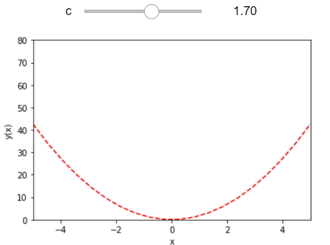
1 2 3 4 5 6 7 8 9 10 11 import numpy as np%matplotlib inline import matplotlib.pyplot as pltdef myPlot (c) : x = np.linspace(-5 ,5 ,20 ) y =c * x**2 plt.plot(x,y, 'r--' ) plt.ylabel('y(x)' ) plt.xlabel('x' ) plt.ylim([0 , 80 ]) plt.xlim([-5 , 5 ])
1 2 c_slide = wg.FloatSlider(value=1.0 , min=0 , max=3.0 , step=0.1 ) wg.interact(myPlot, c=c_slide)
interactive(children=(FloatSlider(value=1.0, description='c', max=3.0), Output()), _dom_classes=('widget-inter…
<function __main__.myPlot(c)>
actual data example 1 titanic = pd.read_csv('train.csv' )
PassengerId
Survived
Pclass
Age
SibSp
Parch
Fare
count
891.000000
891.000000
891.000000
714.000000
891.000000
891.000000
891.000000
mean
446.000000
0.383838
2.308642
29.699118
0.523008
0.381594
32.204208
std
257.353842
0.486592
0.836071
14.526497
1.102743
0.806057
49.693429
min
1.000000
0.000000
1.000000
0.420000
0.000000
0.000000
0.000000
25%
223.500000
0.000000
2.000000
20.125000
0.000000
0.000000
7.910400
50%
446.000000
0.000000
3.000000
28.000000
0.000000
0.000000
14.454200
75%
668.500000
1.000000
3.000000
38.000000
1.000000
0.000000
31.000000
max
891.000000
1.000000
3.000000
80.000000
8.000000
6.000000
512.329200
1 2 3 titanic.dropna(subset=['Age' ], inplace=True ) titanic.sort_values("Age" , inplace=True ) titanic.head()
PassengerId
Survived
Pclass
Name
Sex
Age
SibSp
Parch
Ticket
Fare
Cabin
Embarked
803
804
1
3
Thomas, Master. Assad Alexander
male
0.42
0
1
2625
8.5167
NaN
C
755
756
1
2
Hamalainen, Master. Viljo
male
0.67
1
1
250649
14.5000
NaN
S
644
645
1
3
Baclini, Miss. Eugenie
female
0.75
2
1
2666
19.2583
NaN
C
469
470
1
3
Baclini, Miss. Helene Barbara
female
0.75
2
1
2666
19.2583
NaN
C
78
79
1
2
Caldwell, Master. Alden Gates
male
0.83
0
2
248738
29.0000
NaN
S
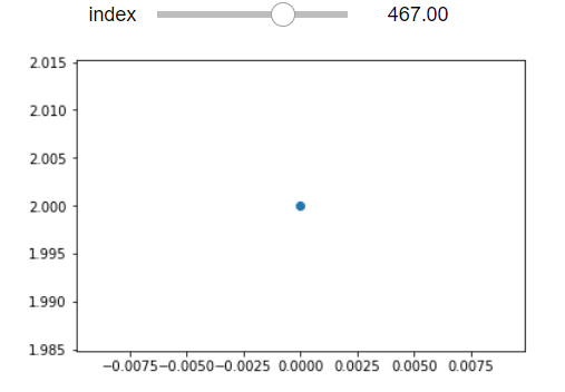
1 2 def myPlot (index) : plt.scatter(0 , titanic.iloc[int(index),:].loc["Pclass" ])
1 2 3 4 5 6 a = wg.FloatText() b = wg.FloatSlider() display(a,b) mylink = wg.jslink((a,'value' ), (b,'value' )) index_slide = wg.FloatSlider(value=0 , min=0 , max=len(titanic)-1 , step=1 ) wg.interact(myPlot, index=index_slide)
FloatText(value=0.0)
FloatSlider(value=0.0)
interactive(children=(FloatSlider(value=0.0, description='index', max=713.0, step=1.0), Output()), _dom_classe…
<function __main__.myPlot(index)>
widget_types can be found in:widge types
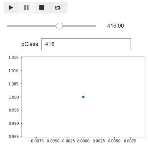
1 2 3 4 5 6 7 8 9 10 11 12 13 14 15 16 17 18 19 20 21 22 23 24 25 play = wg.Play( value=0 , min=0 , max=len(titanic)-1 , step=1 , interval=200 , description="Press play" , disabled=False ) slider = wg.FloatSlider(value=0 , min=0 , max=len(titanic)-1 , step=1 ) text = wg.FloatText( value=0 , min=0 , max=len(titanic)-1 , step=1 , description='pClass' , disabled=False ) wg.jslink((play, 'value' ), (text,'value' )) wg.jslink((play, 'value' ), (slider,'value' )) ui1 = wg.HBox([play]) ui2 = wg.HBox([slider]) display(ui1) display(ui2) wg.interact(myPlot, index=text)
HBox(children=(Play(value=0, description='Press play', interval=200, max=713),))


HBox(children=(FloatSlider(value=0.0, max=713.0, step=1.0),))


interactive(children=(FloatText(value=0.0, description='pClass', step=1.0), Output()), _dom_classes=('widget-i…


<function __main__.myPlot(index)>